Communicating Through Color and Delivering Consistent Omnichannel Experiences
By Adrián Fernández, Vice President & General Manager, Pantone
Communicating Through Color and Delivering Consistent Omnichannel Experiences
15 June 2018
Fashion, accessories and beauty designers need to ensure that color not only cohesively translates across different materials, but also across different media such as e-commerce imagery, packaging and within the retail environment. If color varies too much across multiple touchpoints, the customer experiences suffers. According to a study by The CMO Council in August of 2017, two-thirds of marketers say consumers are very or extremely sensitive to visible differences between the images they see online and in-store.

But color consistency is achievable if brands can smoothly traverse the line between digital and physical elements within the workflow and get deep into the specifications when working with producers of your end product and packaging. Color can stay consistent from the initial design to the retail rack by implementing the right best practices and tools.
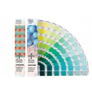
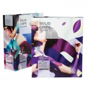
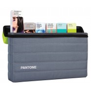
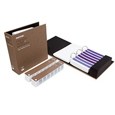
Within our culture of continuous improvement, Pantone has now been able to embrace new tools and processes to enhance and better sustain our printing. Thanks to PantoneLIVE, X-Rite product sophistication and adaptability, and industry experts with the ability to harness the latest, advanced technology, we are pleased to release a more color-critical and exciting Formula Guide than ever before!
Identify the intersections of digital and physical in your workflow. Designers should consider points of translation between physical and digital design elements during the creative process. Some designers don’t believe they need to worry about the digital since they design entirely using physical processes, however, in our mobile-first, digital content consuming world, the ability to represent physical items attractively and accurately in a digital purchase environment can be the difference between "on sale" and "sold out."
When you connect product creation and digital marketing with physical product packaging, the touchpoints all mirror one another and provide consistency for your brand both online and in the store (or on the customer’s doorstep). Customers are less likely to return products when they appear the same in both the digital and physical realm, making color matching throughout the process important.
Close the Gap with Digital Specification. Eighty-six percent of designers have little to no knowledge of the manufacturability of color in their workflow, according to 2015 research by the Pantone Color Institute. Brands need to provide explicit instructions to those who will produce the final product, effectively “closing the knowledge gap” between those designing and those producing the product. There are many tools to do so.
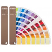
For Fashion, Hone in on Material. Fashion design often starts in the physical, by playing around with palettes and seeing how color appears on fabric. By utilizing color references like paper chips and cotton swatches during the inspiration and palette-building process, you can more easily and accurately communicate with the color producer with that color’s spectral data, which is akin to its DNA. This speeds up the initial production process before the physical check comes back into play during quality control.
Fashion designers can also experiment with 3D renderings of a material with color so it appears lifelike in your design file. For example, a brand may select PANTONE 18-3838 Ultra Violet in a pattern on velvet, 3D scan it and share with the supplier so they can visualize the appearance of color on material, drastically cutting down design approval and production times.
For Packaging, Identify Efficiency Opportunities. Within packaging, back and forth with printers and converters is common – and costly. Sixty-five percent of designers go through two to three rounds with their supplier on color alone. This can be avoided by specifying color digitally versus sending physical proofs, which leaves little to no room for error by ensuring everyone across the value chain is using the same spectral targets.
Integrate Digital Standards into your Workflow. While many brands are cognizant of color chips and swatches, brand style guides, or even product prototypes, they have yet to utilize online tools that drive appearance (including color, texture, and patterns), such as digital color standards. These standards allow us to see how color will appear, and in many cases, how it might change, on the final material. If executed early on in the creative process, brands can ensure a product’s color consistency as it makes its way through the value chain. This type of information can also be shared with marketing to ensure that product photos match the final product color online, helping the marketing team avoid photo reshoots and image touch-ups.
I say, let color reign and potentially change with trend, knowing that your team is capable of color consistency in both the digital and physical environments.
Learn more about color management solutions for fashion and product design here.
Learn more about color management solutions for print and packaging designhere.
A full version of this piece was published in the Think Tank Column of Women’s Wear Daily



 粤公网安备44030402000239号 |
  手机版
手机版 电脑版
电脑版